My goal today was to create a map of the islands of Guadeloupe and Marie-Galant with data observed for 278 points and with interpolation between all points to create a continuous map. I will follow this tutorial:
http://www.qgistutorials.com/en/docs/interpolating_point_data.html
Get the data and load to QGIS
I obtained a map of the boundaries of these islands from the GADM database of Global Administrative Areas, the Guadeloupe shapefile. I use GLP_adm0.shp for this map.
My data with coordinates and observed data for 278 sites is something internal to my lab.
Load map by Layer –> Add Layer –> Add Vector Layer
Load 278-site data (site_coord_ec.csv, UTM zone 20N) by Layer –> Add Layer –> Add Delimited Text Layer
Interpolation procedure
As the tutorial indicates, begin interpolation (after enabling the Interpolation plug-in) by Raster –> Interpolation –> Interpolation.
In the Interpolation dialog, select site_coord_ec as the Vector layers in the Input panel. Select 6_Aplexa_marmorata as the Interpolation attribute. Click Add. Change Interpolation method to Inverse Distance Weighting (IDW). Change the Cellsize X and Cellsize Y values to 10. This value is the size of each pixel in the output grid. Since my source data is in a projected CRS (WGS 84 EPSG:4326) with degree (decimal degrees) as units, based on this selection, the grid size will be 10 degrees (to find the units: Project –> Project Properties –> General tab) (but see here, if coordinates are in UTM then the cell size of 10 may be 10m). Change the xmin, xmax, ymin, and ymax:
xmin: 654337.59999999997671694
ymin: 1754017.80000000004656613
xmax: 695937.59999999997671694
ymax: 1827497.80000000004656613
Click on the … button next to Output file and name the output file as 6_Aplexa_marmorata_ec.tif. Click OK.
I then clipped the resulting surface to the island boundary by Raster –> Extraction –> Clipper (with GLM_adm0 as the Mask layer) and changed the color (in Properties, Style tab) to Singleband psuedocolor, RdBu, Invert, with 0 as a no-data value (in Transparency tab). The results are ok enough:
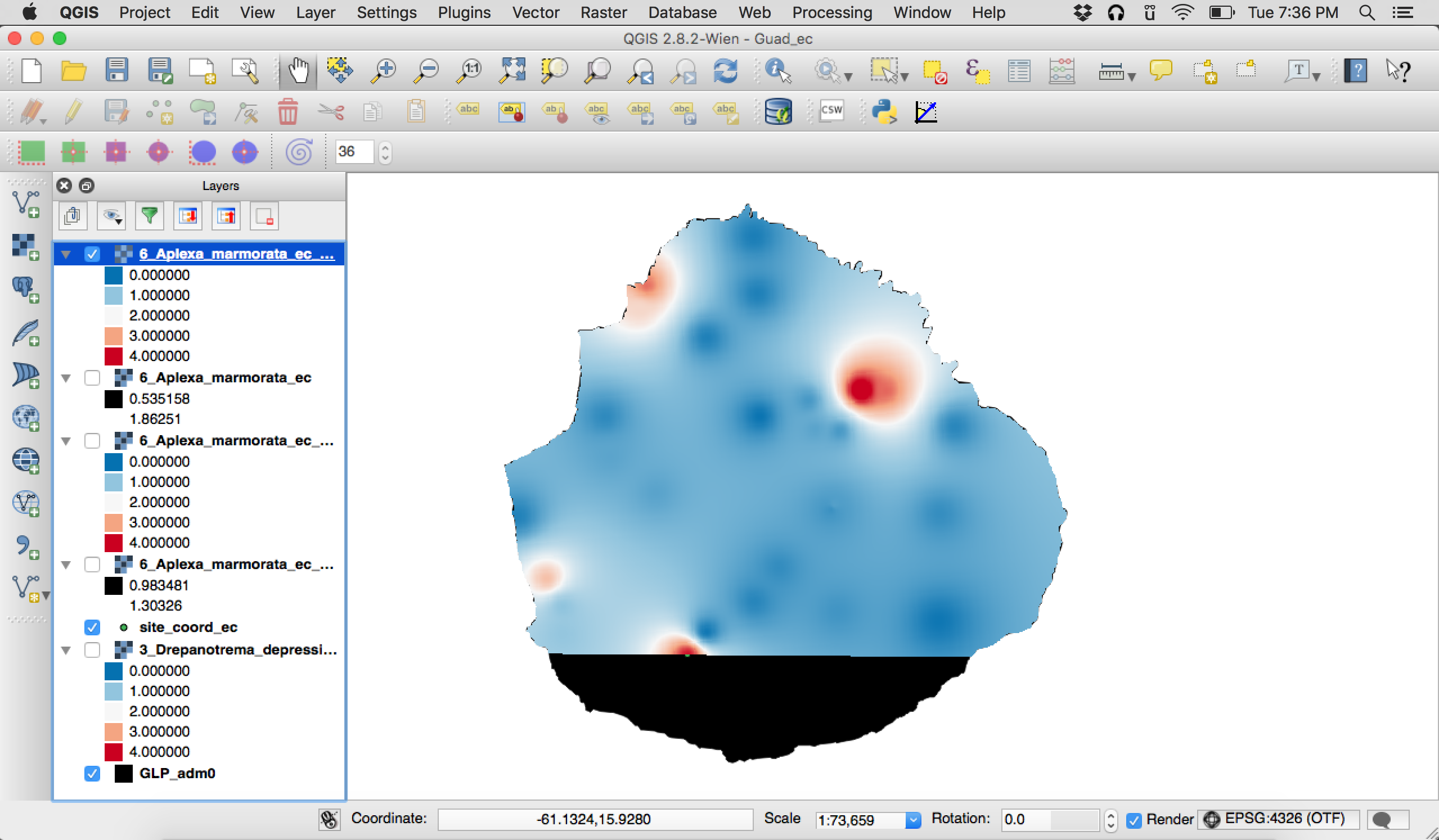
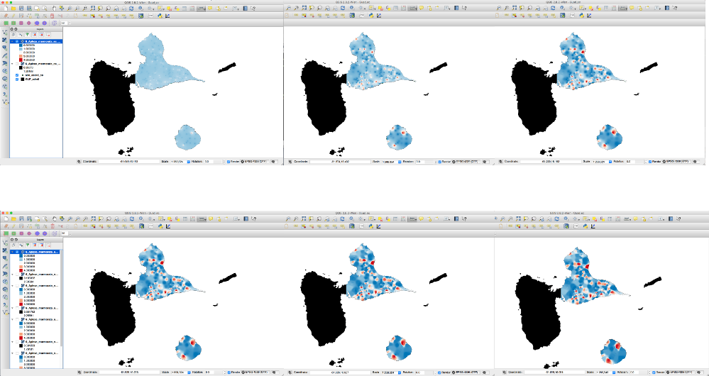
But we can see that the extent of an observed data point is not very wide, certainly not wide enough to make use of multiple data points. We can also see that the map is cutoff. I read more about the interpolation methods here, I decided to change the Distance coefficient.
Weighting is assigned to sample points through the use of a weighting coefficient that controls how the weighting influence will drop off as the distance from new point increases. The greater the weighting coefficient, the less the effect points will have if they are far from the unknown point during the interpolation process. As the coefficient increases, the value of the unknown point approaches the value of the nearest observational point.
I did this by clicking the small wrench icon to the right of the Interpolation method pull-down menu. The picture above uses the default value of 2. I also needed to manually change the Xmin, Xmax, Ymin, and Ymax coordinates to the cutoffs I needed for my map, so I read more here then entered my own UTM coordinates (placed above, below, to the left, and to the right of the edges of Grand-Terre and Marie-Galante). Here are the results when I change the distance coefficient (from left to right row 1: 1, 2, 3 and left to right row 2: 4, 5, 6).
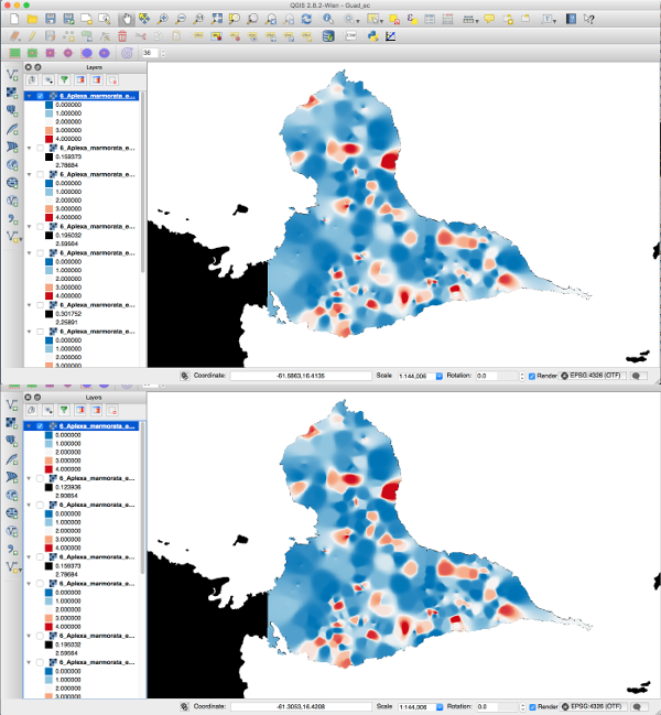
Here’s a closer look at coefficient 5 (top) and 6 (bottom). In the end I chose 5.
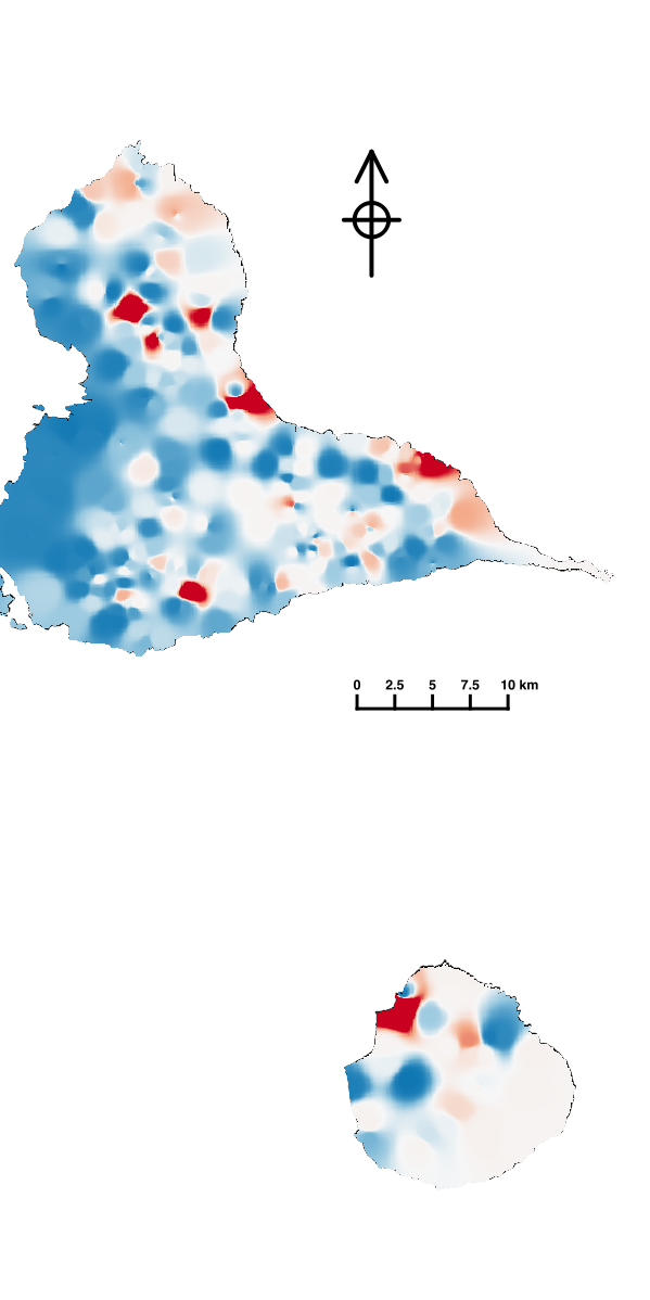
Visualization tweaking
The next step was to be sure the colors corresponded to the thresholds I wanted to emphasize. In my data, there is an important contrast between values below and above 1. To best capture this, I generated a new color map. In Properties for the clipped layer, under style, I chose Render type –> Singleband psuedocolor and in Generate new color map, I chose ‘New color ramp’. For color ramp type, I chose ColorBrewer, RdBu with 5 colors. To apply the colors, I clicked the ‘Invert’ box (for lower values to be blue) and clicked ‘Classify.’ I then manually changed the color values:
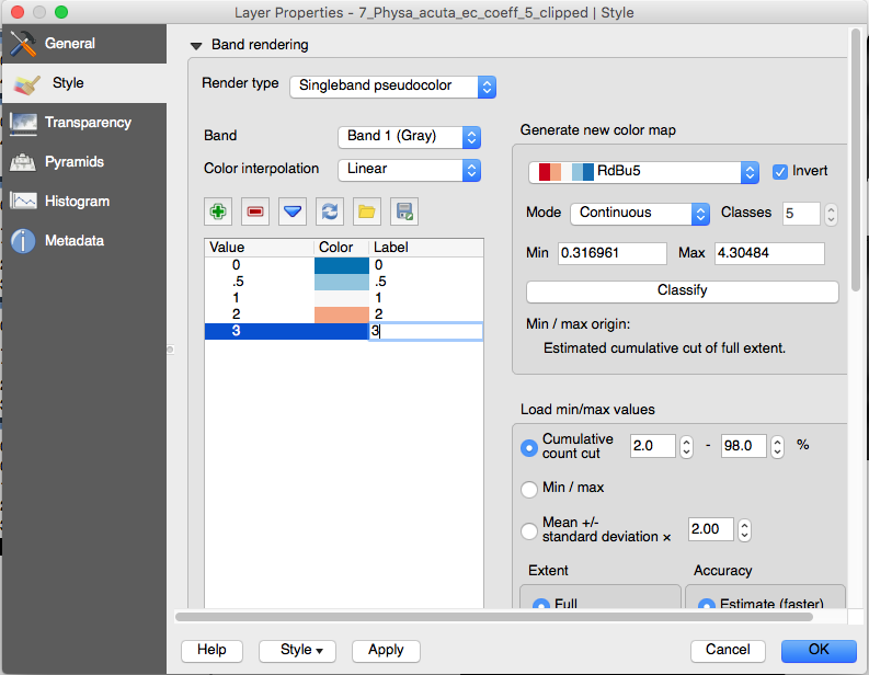
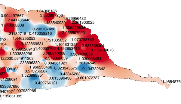
Now, all values below 1 are blueish and all values above 1 are reddish. I can confirm the map captures what I want by quickly displaying the observed values of my parameter:
Finally, I wish to assemble a map, which requires delving into the Print Composer. I followed a tutorial here, with a few tweaks of my own:
- I inserted a North arrow of my choosing as an SVG from one of my favorite iconography repositories, The Noun Project (the icon pictured here is Up, By Creaticca Creative Agency, GB) and specified its size and position (X: 160mm, Y: 70mm, W: 60mm, H:60mm)
- I clipped the map to extends that made sense for my project (Xmin: -61.550, Ymin: 15.8, Xmax: -61.150, Ymax: 16.600)
- I modified the scale bar to my preferences (left: 0, right: 4. Line width 1.5mm. Helvetica Bold 18 pt.. X: 160mm, Y: 100mm, W: 200mm, H: 200mm)
- I re-sized the page to content (and saved all of this as a Print Composer Template for easier reuse)
And voila! I exported as a .SVG (2511×5023 px).
Related Posts
 Animated plot in R
- stiffness and ordinary differential equation solving
- Well put Mathematica Documentation. Well put.
- Calculating the spatial gradient for georeferenced trait values
- “In the automobile industry, a discontinuous second derivative is known as a dent”
- Small things add to big results at CERN